Case study
Help managers see their engagement scores in a more informative and understandable manner
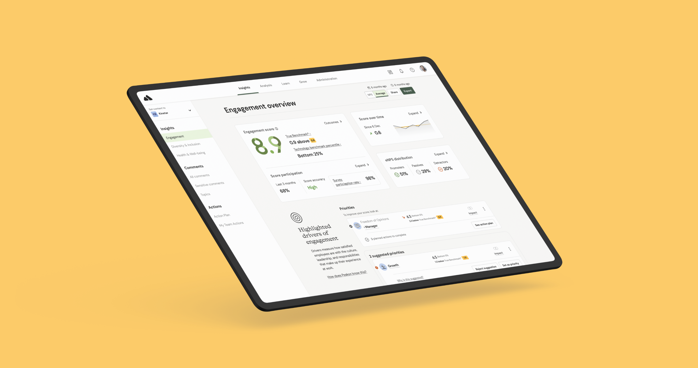
Overview
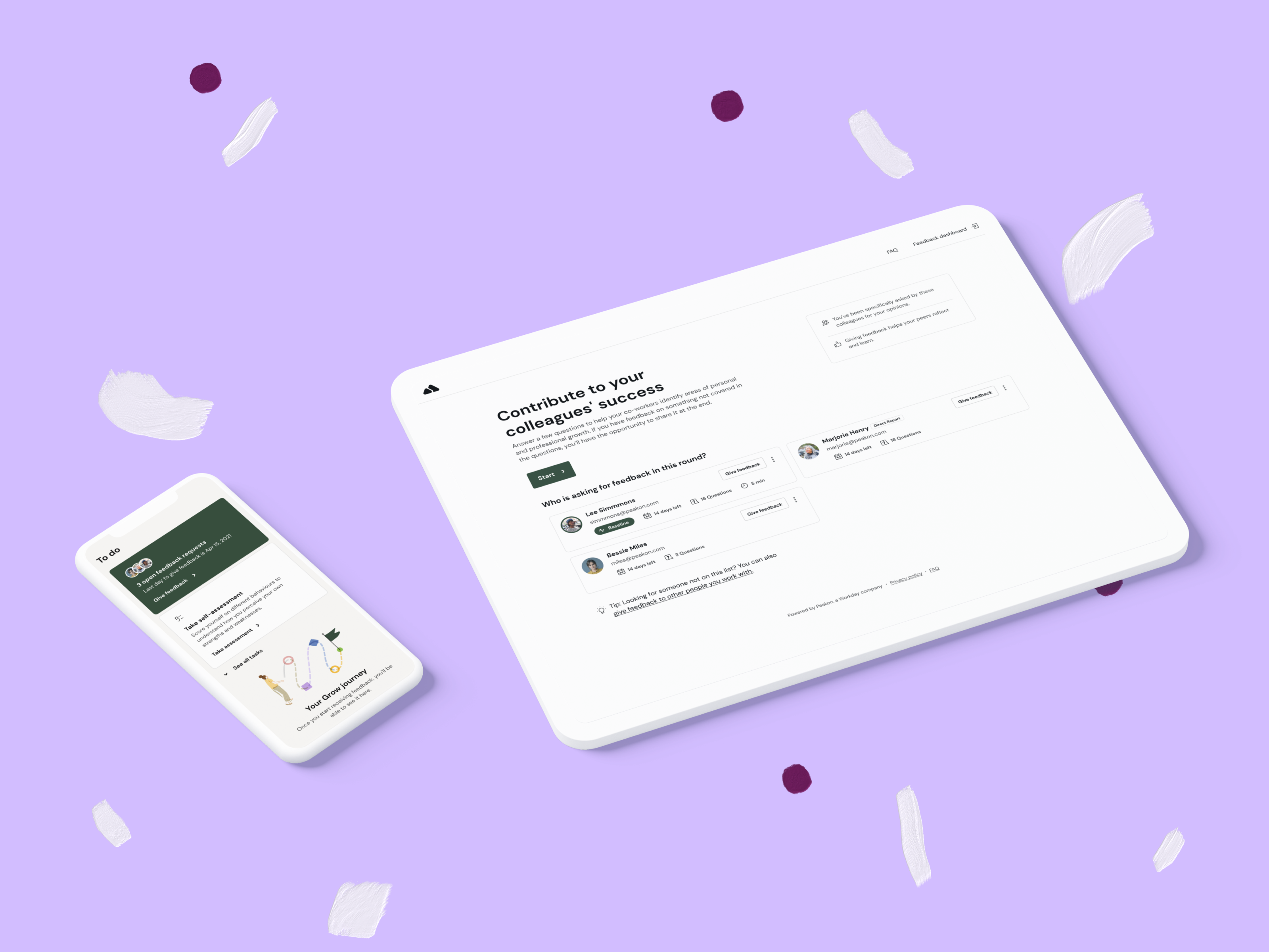
Peakon dashboard hero area presents the user with vital information about their engagement survey data. It includes their overall engagement score, and Peakon uses average scores and eNPS when calculating scores, so the information showcased in the hero area is aggregated across multiple rounds. Besides the engagement score, users can compare their scores with the true benchmark or other benchmarks based on company settings.
With engagement data, users can see the overall participation rate with an option to expand and see individual round participation numbers. Users can also see how many employees have answered that specific question out of the number of employees who have been asked.
A collection of user inputs collected from Customer support have shown that users still have a poor understanding of the fact that scores (and therefore the participation) is not shown on a per-round basis. As a most seen release-state of Peakon Engage dashboard, it hasn’t been improved or looked at for longer times and had some general design inconsistencies.
So we picked it up as a “15%” design project that we have allocated each quarter to figure out how to solve this and propose solutions and next steps.
My contribution
Product discovery
Product design
The team
2x Product Designer
Year
2021
Problem Statement
Help managers see their engagement scores and participation displayed in a more informative, comprehensible manner.
Goal
- We want customers to understand their engagement scores and participation at first glance.
- Decrease the number of users reaching out for detailed explanation and clarification to their admins or our customer support.
- Update the UI to be more consistent and aligned with our Bedrock design system.
Other projects:
Say Hi 👋:
Guntis Rusa © 2021
