Case study
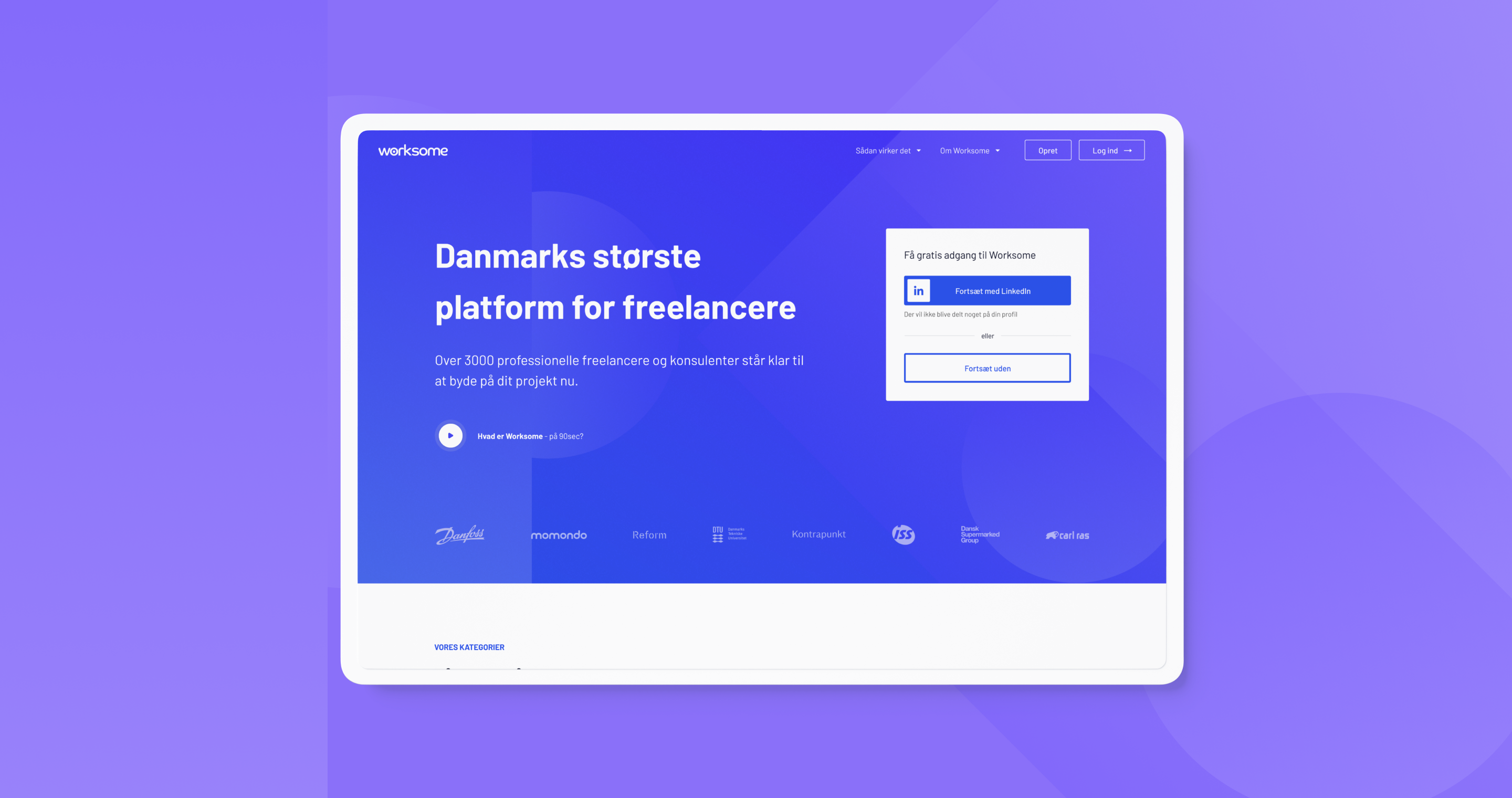
Developing a new creative direction and redesigning Worksomes’ landing page
Overview
Worksome connects highly skilled consultants and specialists with companies seeking flexible talent to solve their critical business issues.
Worksome is a platform that makes companies’ recruitment quick, efficient and agile, by matching talent and competencies with companies’ demand. The screen gathers the best talents in all of the knowledge-heavy fields, and it’s easy and free to create a job post.
The client was looking to develop a new creative direction and redesign worksomes’ landing page. The brief was to look at the landing page and its sections and redesign each part one by one.
One of the requirements was to build on top of the previous brand by keeping the primary blue colour with the possibility of updating it, making it stronger and more modern.
The deliverables included:
- Color palette
- Iconography
- Typography
- Illustrations
- Redesigned landing page
- Redesigned blog article with a new typographic scale
My contribution
Branding
Web design
The team
2x Product Designer
Year
2017
Other projects:
Say Hi 👋:
Guntis Rusa © 2021
